JAPANESE PRINTS
A MILLION QUESTIONS
TWO MILLION MYSTERIES
Ukiyo-e Prints浮世絵版画 |
| Port Townsend, Washington |
|
BAIDŌ KUNIMASA 梅堂国政 ばいどう.こくまさ |
|
SERIES: Children at Play Ukiyo kodomo tawamure |
|
DATE: Ca. 1895 |
|
SIZE: 13 3/4" x 9 3/8" |
|
SOLD! THANKS L! |
 |
||
|
KIDS JUST LOVE TO PLAY IN THE BATH |
|
|
|
|
|
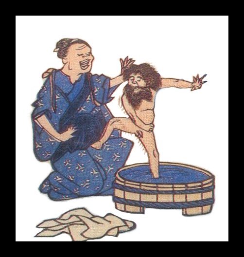
There is a long history in Japanese prints of bathhouse imagery. Perhaps the strangest one I have ever seen is shown in the detail above by an unknown artist. A Japanese woman has just given birth --- not visible here. The father is a Westerner. That explains the hair all over the babies body including the month-long beard. But not only is the baby incredibly hirsute he, as you can see from the anatomically correct full frontal view, is able to stand on his own and maybe even dance around a bit. Quite a bit. I suppose this print was meant to act as a warning to Japanese women not to fraternize with foreigners or look what you might end up with. Could the message be any clearer?
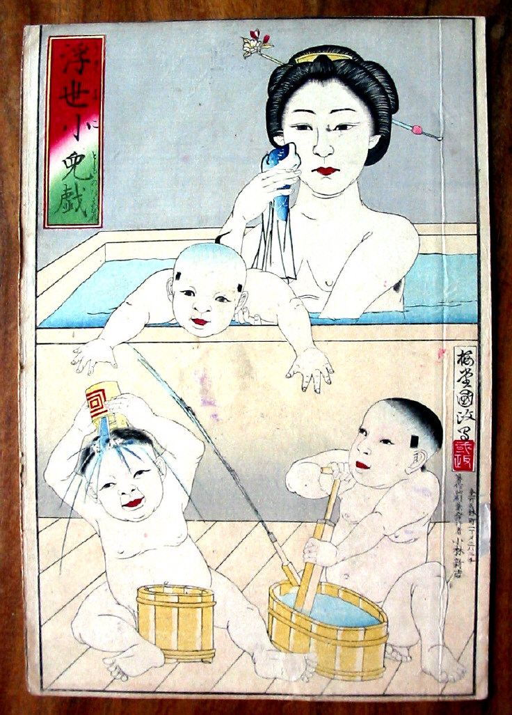
The mother in the print featured on this page must have been more cautious because her children are no way nearly as hairy as our dancing friend. Ergo, the father of these kids must be Japanese too. |
|
|
|
HOOSIER DADDY? |
|
|
|
Okay, I know...hoosier should be spelled "Who is your" or "Whose your", but I like the play on words and besides I heard a few years back that "Hoosier Daddy" was/is the name of a rock band. Don't know for sure. Anyway, above is a detail from a triptych by Yoshikazu showing a Westerner who has apparently spontaneously broken into dance. A coincidence? Maybe? Maybe not. Perhaps this would provide one of those ever elusive clues to nature vs. nurture. If only we could do some DNA testing here. But, alas, I think not. All we can do is speculate. Not only could this image of a Westerner in white clothes and beard give us a hint at paternity, but maybe, just maybe, it might tells us who created the anonymous image of the hirsute, dancing baby seen with his nurse above. |
|
ARE YOU EVER DISAPPOINTED IN A PRINT YOU HAVE BOUGHT OVER THE INTERNET OR FROM A CATALOGUE AND HAVE NEVER HANDLED IN PERSON ONCE IT HAS ARRIVED? |
|
|
|
 |
|
|
|
|
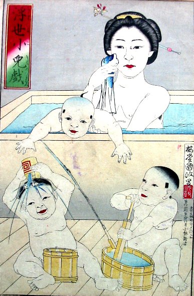
Above are two jpeg examples of exactly the same print taken at almost exactly the same time by the same camera, but positioned differently for each shot. The one on the right was taken at an angle parallel to the light source --- my picture window which basically faces south --- while the one on the left was taken at a 90° angle to the same source. Both show prominently soiling and staining to the surface areas, but what does not show in the one on the left is the prominent crease that can be found on the print itself. I am pointing this out to you as a cautionary note: Before you purchase a print you have not handled in person you should ask the seller to provide you with as full a detailed condition report as possible. Then you will get a better idea of what you will really be receiving.
Everything depends on how it is presented to you initially. I could have posted a larger version of the one on the left as the main image on this page, but then you and everyone else might have missed the prominent crease even if I had mentioned it in a condition report within the overall description. As the seller I could have always said "Well, it is right there in black and white, or should I say black and baby blue, for the whole world to see." But graphically the image itself makes a much greater impact. The one on the right was taken in what is referred to as a raking light. Museum conservators often take such images of paintings and works on paper to better see the 'true' condition of a work of art. Generally when seen full on the ripples, creases and other flaws tend to disappear visually. However, when photographed at sharp angles with strong lighting all kinds of blemishes become much more apparent. You can see this often if you stand at a sharp angle to a painting in a museum or even stoop down and look up at the piece on display. Of course, the closer you get the easier it is to see these things, but on the other hand you may be asked to step back by an alert guard whose duty it is to make sure you aren't going to do anything untoward. You would be surprised how different pieces look when observed this way. But it isn't only problems that show up. Sometimes a slightly different perspective can give you a whole new way of thinking about the piece. For example, children sitting on the ground before a pre-Renaissance painting of a Madonna and Child covered with gold tooling will see the image much differently than the adult who may be standing before it. That is because the lighting on the painting will catch the glimmer of the gold for the child better and what seems somewhat humdrum to the adult will sparkle for the child. Another example: There was one 16th century Venetian artist who liked to create large and elaborate paintings. If you stood before one of his pieces in just the right spot you just might notice that he had painted on a canvas woven in a herring-bone pattern. This is highly unusual choice which almost no other artists would have made. It was a conscious decision because he did this on numerous other occasions. However, looking straight on like the average museum visitor you would never notice this. In fact, almost no one would ever notice, but it most certainly there and not only that, but there and visible if only you know how to look at.
While Japanese prints may not be like the painting on the herring-bone canvas they do have their fine points, their own unique personalities and their hidden secrets which can only be completely appreciated through thorough inspections which require more than a casual glance or even a doting one. |
|


 HOME
HOME